
CONTEXT:
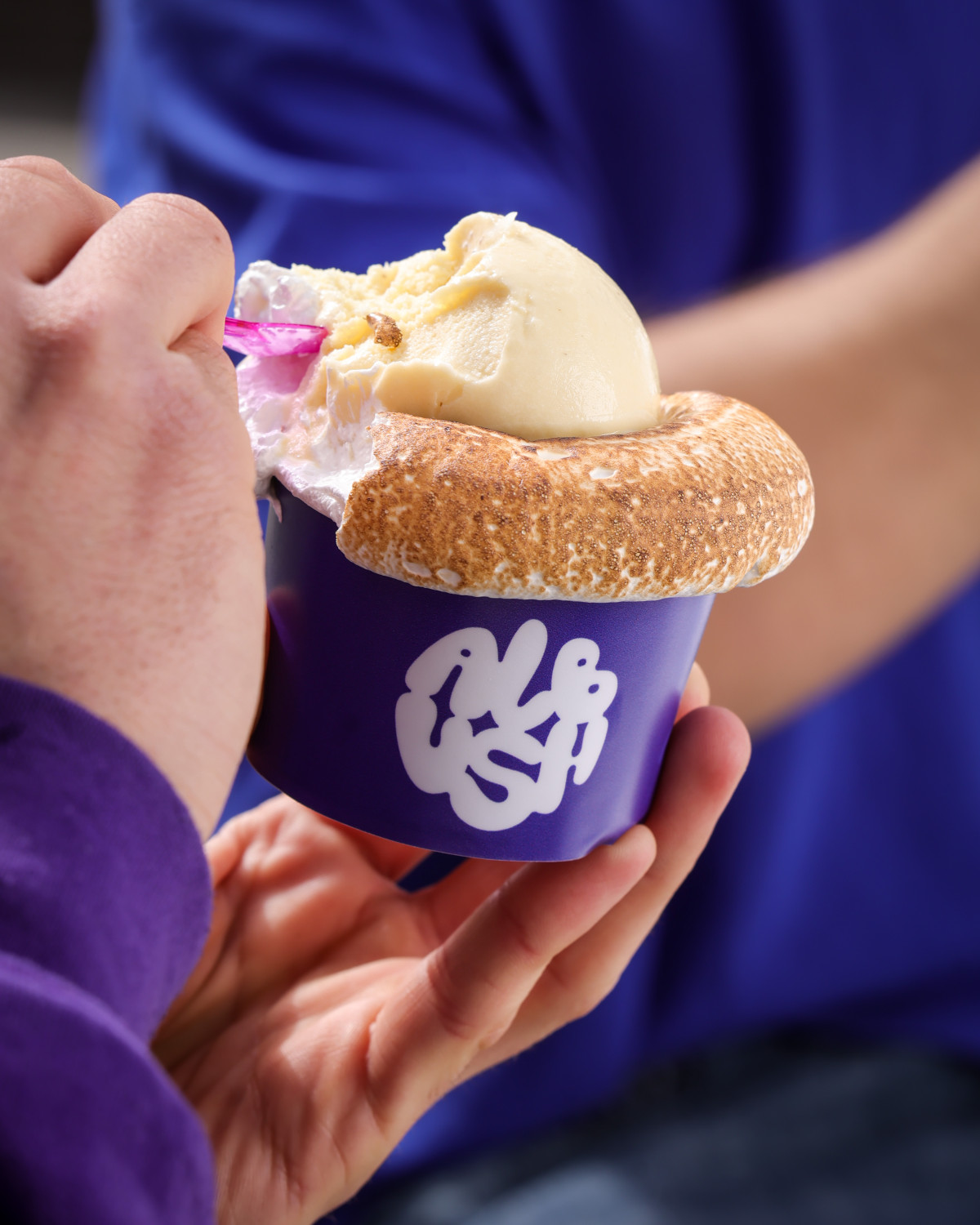
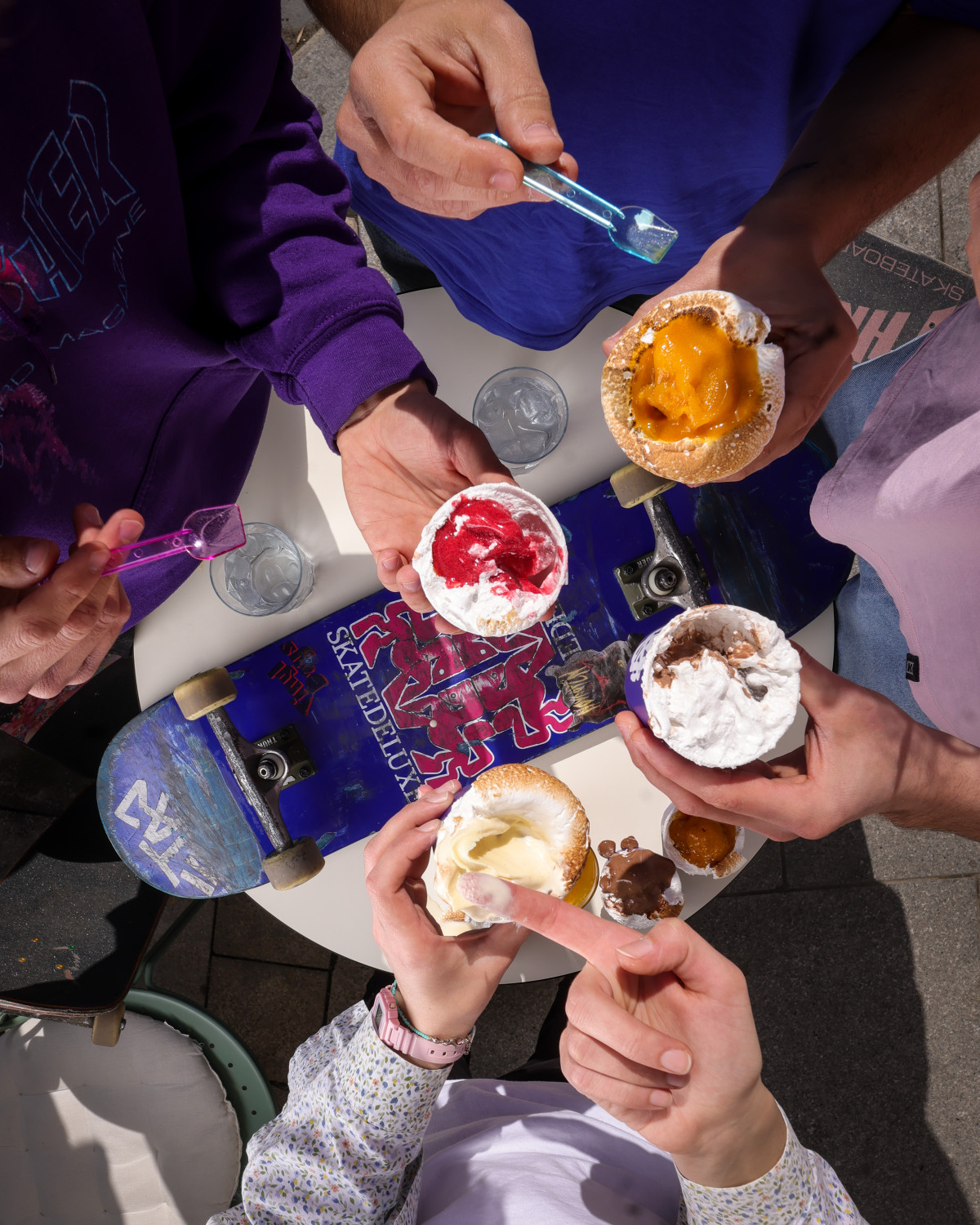
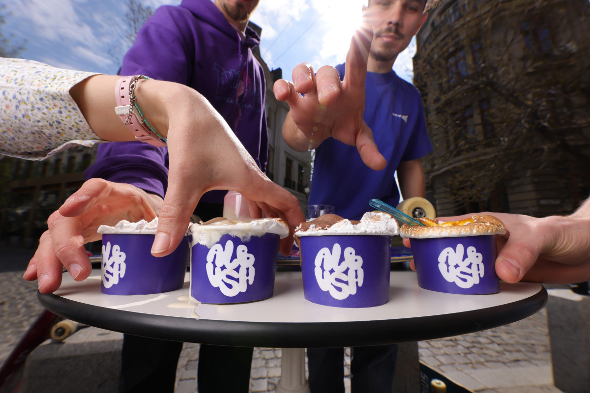
Albush is a bold, light-hearted ice cream brand that turns indulgence into play. The challenge was to capture the airy texture of its marshmallow base and the joy of discovering something unexpected — a new way to enjoy ice cream, lighter and brighter than ever before.
Brand Strategy & Naming
The strategic direction centered on innovation with personality. Albush needed to stand out through both its idea and its tone — fun, confident, and unmistakably different. The name Albush comes from the Romanian albuș (“egg white”), the ingredient that gives the product its signature lightness. Simple and expressive, it embodies the brand’s playful yet refined spirit, translating texture into identity.
Visual Identity
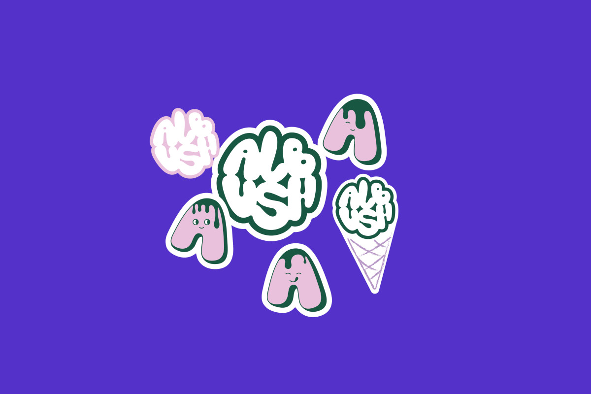
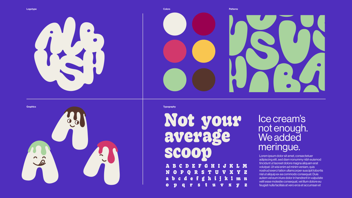
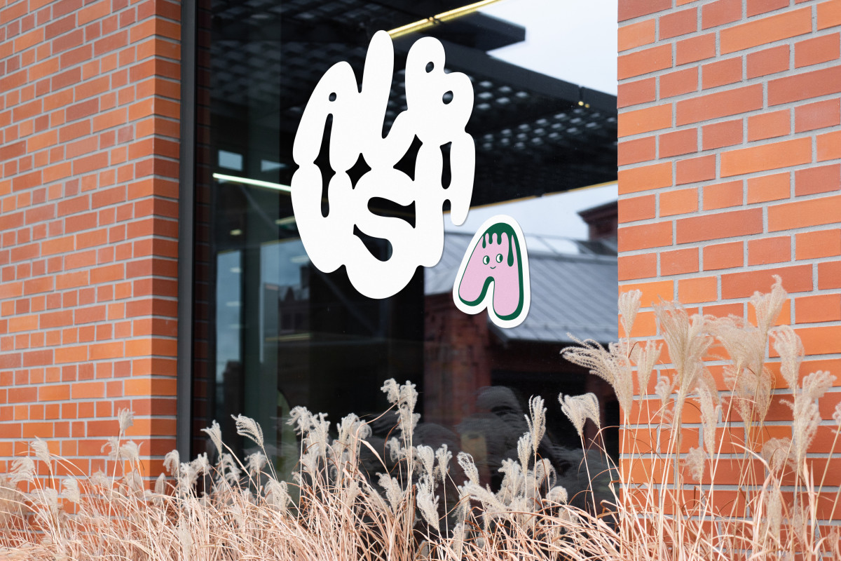
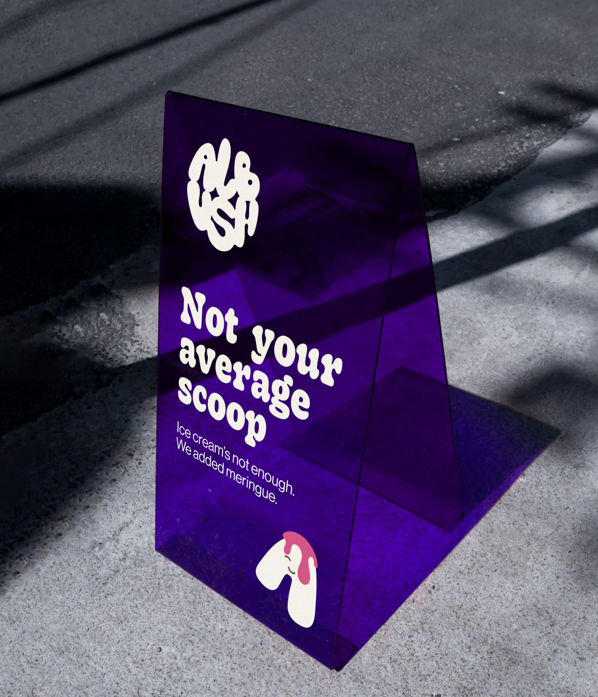
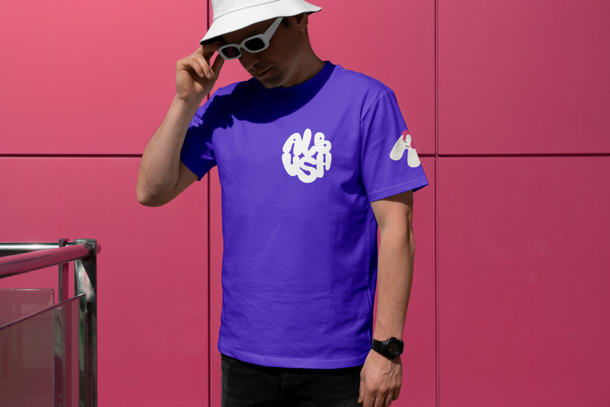
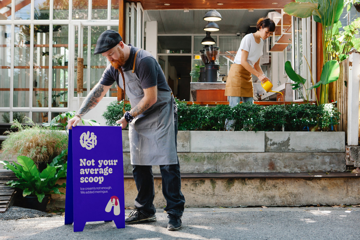
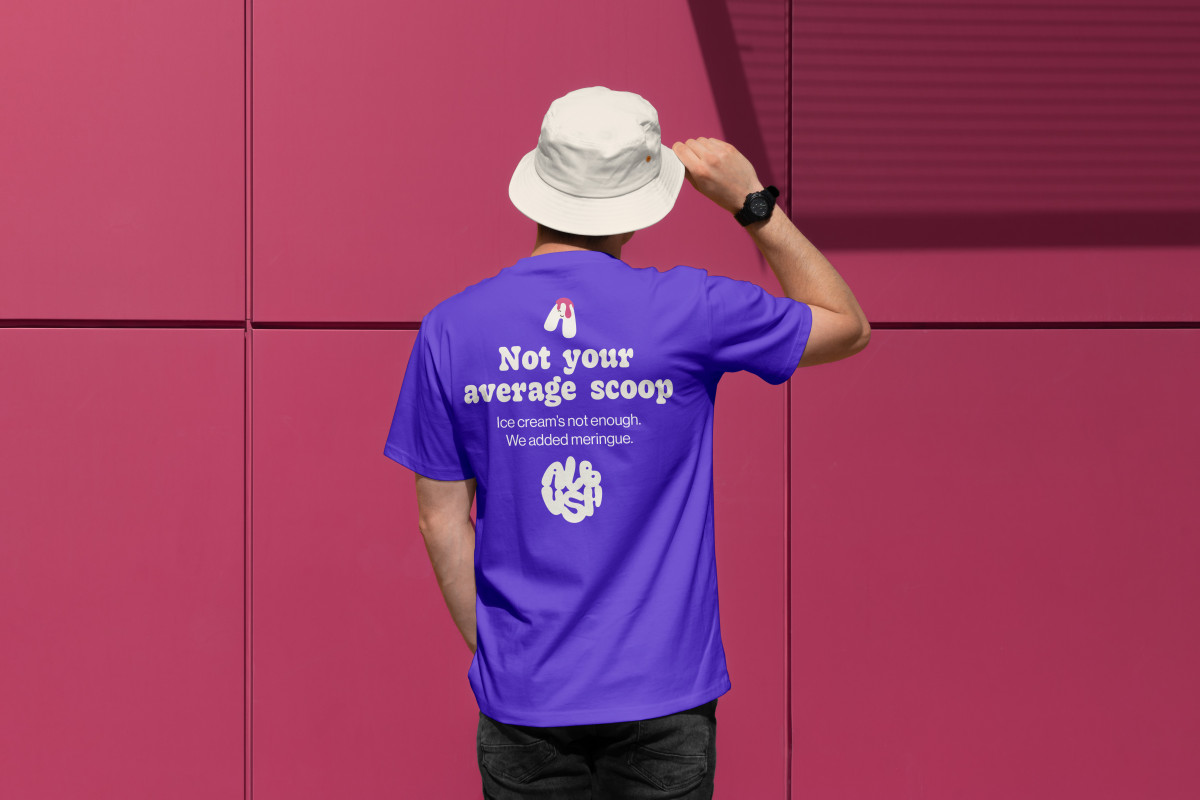
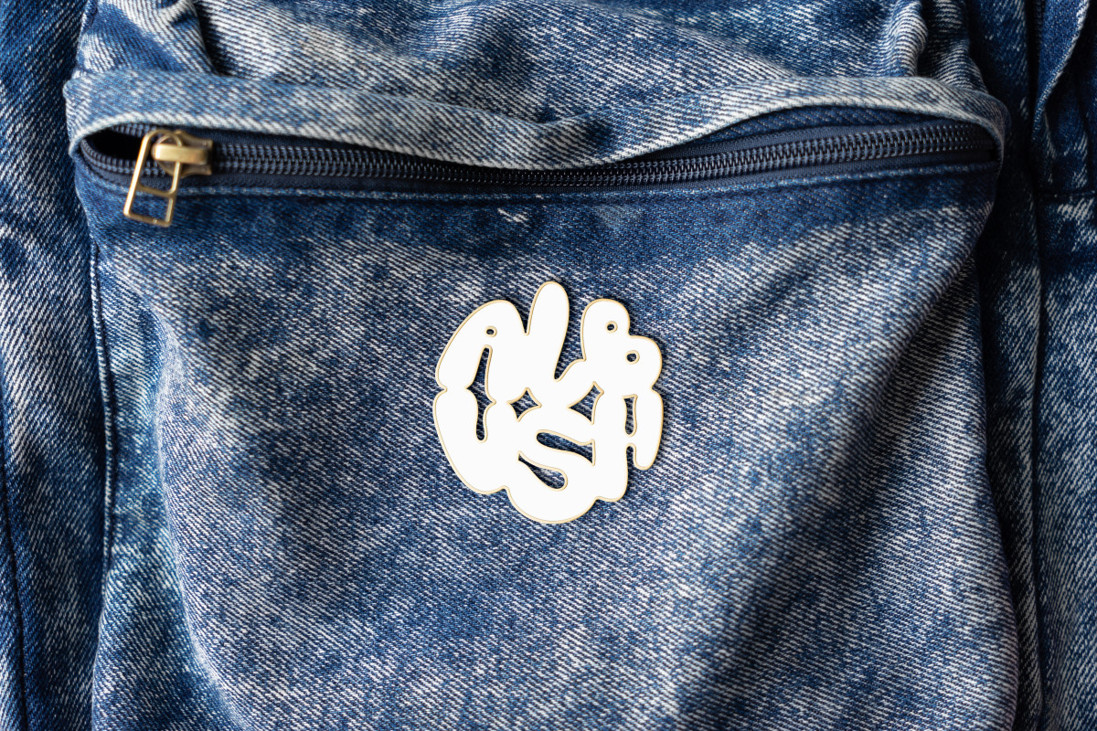
The visual identity reflects Albush’s dual nature — clean design with a sense of whimsy. The logo combines round, generous shapes with airy spacing, evoking both creaminess and lightness. The typography mirrors the rhythm of whipped meringue — soft curves, subtle contrasts, and a floating balance between delicacy and confidence. The color palette is bright and edible, inspired by the natural tones of ice cream and the joy of summer. On the packaging, bold white spaces and playful elements keep the design fresh and instantly recognizable, allowing the product to stand out without shouting.
Albush has quickly found its place in Bucharest’s urban rhythm — a sweet pause that turned meringue into a small city trend.